Designing with the user experience in mind is a must for every designer working in marketing. There are lot of different “designers” with all different skill sets that make projects come to life. I am a graphic designer, but even I dip my toes into video, photography, and web design sometimes. A specific design field that has exploded in importance over the last few years is user experience design. Many companies still don’t know what that is or how badly it is needed in today’s digital world.
UX (User Experience), according to Trellis, is how a person “interacts, engages and experiences a design. The main factors that any UX designer needs to consider are usability, design, human factors, accessibility, and utility.”

AN EXAMPLE:
Let’s say you are an insurance company trying to make it easier for customers to make a claim. As a UX designer, you decide an app would be the best solution. Now the app has to be easy to use and efficient, especially if most people will be using it right after they have just been in an accident. A great UX designer has empathy and can put themselves in someone else’s shoes. The goal of this app is to allow customers to quickly make a claim in the easiest way possible. Chances are they are very stressed as this moment and a negative experience on the insurance companies end could be detrimental to their business. According to Alina Wheeler, author of Designing Brand Identity, “Every customer interaction must be viewed as an opportunity. A memorable experience generates positive buzz and is fun to share; a bad experience becomes a lost opportunity that can sabotage the brand.”
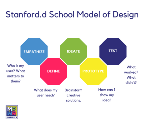
Not every company will have an app, but UX applies to almost anything, especially websites. UX is about solving problems. It takes research and within the digital space you have an added step of performing testing. Every company needs a website. Say you have a problem with visitors being confused and leaving your site which hurts revenue. The company needs to figure out what the issue is and do some testing. Maybe people are confused because information is not organized in the best way. Maybe the hierarchy is bad and people can’t read or find content. Maybe the website is not mobile friendly. There are many ways to tackle how to design the best UX, we like the stanford.d school model. Its 5 steps are a great way to tackle potential UX problems. 
The Stanford.d School Model steps are:
Empathize
Putting yourself in you customers shoes will help you understand their pain points.
Define
After you are in their shoes, you can better define the problem and work towards a solution. What are the specific problems that need to be fixed?
Ideate
Now that you’ve identified the pain point, it’s time to brainstorm and work on ways to correct the issues at hand. Design that app. Make a mock-up of your website.
Prototype
Now that you have some ideas, it’s time to make a draft. If the solution was an app, the designer would make a non-working draft of the app to be shared with others for feedback. This is when the website is tested and shared with shareholders.
Test
If the prototype is agreed upon, share it with your audience. After testing with your audience, did it solve the problem? Or is back to the drawing board? The goal is to have your audience report a better experience with the proposed solution.
As a graphic designer, my process might differ a little, but I still need to understand these steps in my work too. Sometimes the solution to the UX problem is graphic design.
These five principles of visual design effect UX as well:
1. Scale Scale is used to aid hierarchy and highlight important content.
2. Visual hierarchy Hierarchy used to give a viewer’s eye a start and stop place. To guide their eye through content in order of importance.
3. Balance You want your designs to be balanced. Unless you want viewers to feel anxious or uneasy make sure elements are equally distributed across your page.
4. Contrast Contrast is visually exciting and can be used to highlight content and show that elements are different from one another. In UX a red button that is contrasted with other colors on the page is usually an indicator to delete something.
5. Gestalt theory In the simplest terms, gestalt theory is based on the idea that the human brain will attempt to simplify and organize complex images or designs that consist of many elements, by subconsciously arranging the parts into an organized system that creates a whole, rather than just a series of disparate elements. It uses the principles of proximity, similarity, continuity, closure, and connectedness. For example, the human brain likes when similar things are grouped together.
Graphic design is not just about making things pretty but to serve a function/purpose. This coincides with UX. In this case these principles can help usability, leading to a better experience. Visual design is basically a combination of graphic design and UX. A lot of design specialties intertwine with each other and share a lot of the same concepts. In the end it’s about solving a problem. It’s about asking how can I make my customer’s life easier? How can I make them feel good when interreacting with my business?
Positive experiences will keep your customers coming back, increase your revenue, and better position yourself in the market against your competitors. UX may be a relatively new concept but it’s definitely here to stay.