Good graphic design looks effortless. So much so, that some businesses see good design and think, “Hey! I can do that!” Spoiler alert: they cannot do that.
The reality is graphic design is a skill that requires a ton of practice and learning. And while good design is hard to articulate, bad design, well, that is EASY to talk about. We’ve all seen bad design. And while sometimes beauty is in the eye of the beholder, there are specific design sins that you should avoid like the, well, like Covid-19.

13 COMMON GRAPHIC DESIGN MISTAKES TO AVOID
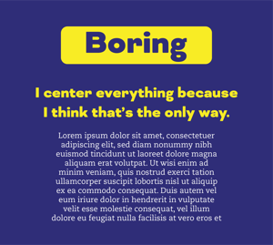
1. Don’t center everything.
Most people’s first instinct is to center everything on a page. Images, text, etc… Although this has a place in formal designs or for specific purposes, it can create a boring layout that also has visual flow issues since there is no line for the eye to follow.

2. Warped or naked photos.
This is my biggest pet peeve and, in my opinion, an ultimate no–no for a business. Your photo doesn’t fit so you stretch or squeeze it into your layout. Now you have unprofessional photos with people possibly having coneheads. Naked photos are photos that bleed into the color of their layout. Use a thin border around the photo to solve the issue issue.

3. Too many fonts.
Typography is a really powerful tool for design. Having too many fonts can clutter a design, make it inconsistent, and make the layout feel chaotic. For the basics, I recommend using a headline font and contrasting a body font.

4. Borders and boxes.
They are good when used right. But people tend to use bulky borders and boxes because they think that’s the only way to separate information. Negative space can usually handle the job. At MPWRSource, we like a 3px border. It is weighty enough to show, but still light enough that it is not clunky nor detracts from the image at hand.

5. Missing Margins.
Make sure text and images have enough space around them. Things squished up against each look bad, hurt readability, and make content hard to distinguish from another.

6. Stair stepping text.
Beginners are usually afraid of white space and will try to fill areas by spacing text awkwardly down the page. It looks bad and hurts readability. Align text horizontally or vertically and let white space do its job—to highlight content.

7. Clutter and corners.
Like I said earlier, beginners are scared of white space. They try to fill every corner of the page making a cluttered design. It’s confusing, ugly, and hurts hierarchy. Good use of space makes the page flow better and highlights your information properly.

8. Trapped space.
Make sure white space flows outward. Don’t place elements in a way that creates a bubble of space. It’s distracting.

9. Busy backgrounds.
This is another sin I see quite often. Don’t have a background that competes with your other elements. Putting text on a pattern for instance. It’s ugly and makes viewers immediately want to look away. Sometimes a simple color overlay at half opacity can temper the textured background just enough to help with that.

10. Tacky type emphasis.
In order to emphasize text or create added design effect, beginners will often reverse, stroke, all cap, or underline their text. It isn’t needed and does more harm than good. If you stroke your text, I will come after you.

11. Bad Bullets.
If you use bullets for your text, make sure they are aligned and don’t use any smiley faces as bullets. It’s always better to decorate your bullets with just color.

12. Widows and orphans.
These are single words left at the top or bottom of a paragraph. Sometimes they are hard to avoid but always try to avoid incomplete type. It looks awkward and breaks the pace of reading.

13. Rivers.
You see this with justified type. Justifying text can create huge spaces between words which cause readability issues and is distracting. Use left aligned text unless you have a specific reason for using justify. And if you do, get rid of rivers by adjusting the column width and text size.
There you have it, the 13 layout sins. Yes, there are many more graphic design mistakes to avoid. But these are the ones that should always remain top of mind.
Learning never ends for any designer. There is always something to learn and improve on. However, knowing at least some of the basics will help businesses when they need produce collateral on their own. Even better it helps businesses be able to effectively communicate with designers making the process much better. It also allows them to give better feedback, understand design decisions, and collaborate better. Knowing how much goes into good design can help businesses understand the importance of making sure their strategy stays on target. These tips will improve your designs and will help any business communicate with their designer better. If everyone can be on the same page it will only help improve the process and ROI. Now take these lessons into the wild young padawan and design away.